After looking into emissions across different regions and income levels for the family planning post and the consumer sustainability post, I was super curious to explore a detailed breakdown of these emissions numbers. How does the US have some of the highest emissions per capita at 14 tons, more than double – or even triple --- some of its developed nations counterparts like Sweden (3.8 tons), the UK (4.9 tons), or Japan (8.2 tons)?
I first suspected that some of this was due to the US’ high oil and gas production. And indeed, many of the countries with the highest emissions per capita are some of the world’s largest oil producers (Qatar, 37 tons, Saudi Arabia, 18 tons, Kuwait, 20 tons) but the correlation isn’t perfect. Norway, which lands in the top 5 for most oil production per capita, only produces 7 tons CO2 per capita. Russia (10 tons) also comes in below the US despite ranking higher in oil production per capita.
So lifestyles are playing a part in driving these emissions numbers. But to what degree? To test this, I wanted to see if I could replicate emissions per capita for several countries using average household budgets, miles traveled, and emissions factors.
I hoped to understand better:
- What does the US do in excess to get to such a high emissions per capita number compared to other developed nations? How far can we decarbonize while minimizing impacts to our quality of life?
- What are developing nations with very low emissions per capita sacrificing in quality of life to achieve those numbers? What kinds of practices can help them achieve a better quality of life in a sufficiently sustainable way?
The 7 countries I studied were: US, UK, Sweden, India, Argentina, Nigeria, and Japan. This group had good availability of data, “different-enough” geographies and lifestyles, and a wide distribution of emissions per capita numbers.
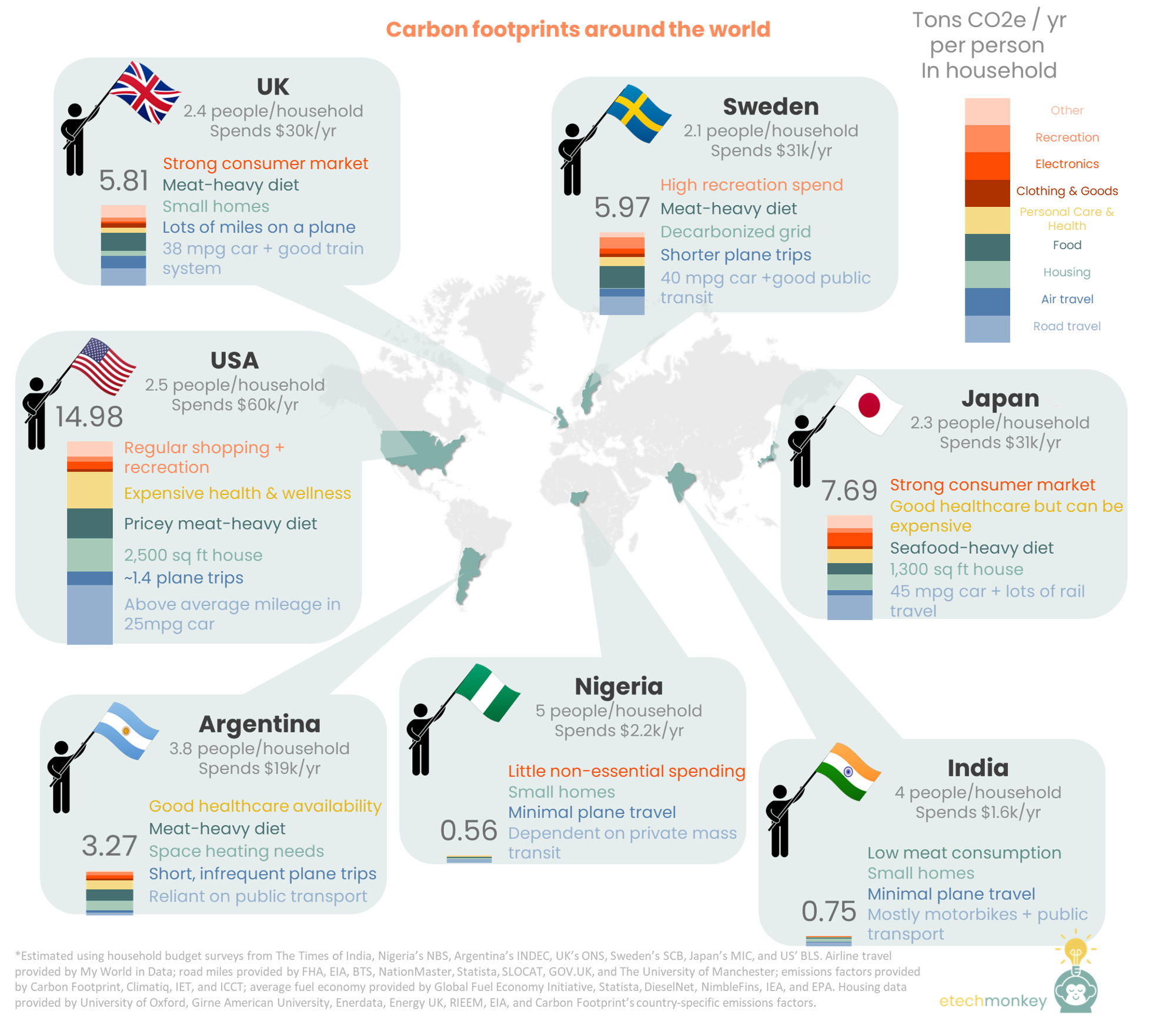
Here are the results (and for those curious on methodology, that’s at the bottom of this post):
Observations & takeaways:
- Road transportation is a huge factor in emissions numbers. The largest share of emissions for most of the countries with cars or motorbikes as a main form of transport (US, UK, Nigeria, Japan, and India all drive >3,000 miles/person in vehicles every year) is road transport. On an absolute emissions basis, the single largest contributor to personal emissions across the 7 countries is the US’ road transport category, at 4.4 tons / person / year. So transport is well-deserving of being targeted as a high-impact category for energy transition.
If the US were to switch to EVs, we could see that 4.4 tons number drop to 1.4 tons, a 70% drop in emissions. If the US were to switch to high efficiency vehicles (average of 45 mpg), we could see a 43% drop in emissions per capita (4.4 to 2.5). With denser urban populations, it’s possible that VMT drops. Assuming the US average drops to the New York average and changing nothing else, that would drop our emissions per capita by less than 30%. But waiting for that drop to occur means waiting for enough urban transportation to develop to replace a car, which can take a loooong time in addition to being unrealistic for many people who can’t work in an urban setting.
So clearly the highest impact (and for most people of sufficient means, the easiest) action we can take as a consumer with minimal impact to lifestyle is to switch to an EV. For those that don’t want to give up the reliability of current gas infrastructure, the equivalent reduction in emissions can be achieved by driving a super high-efficiency vehicle, or a car with fuel economy above 80mpg (some PHEVs can already do this if driven long enough in EV mode). - Decarbonized grids + smaller, more energy efficient houses can very effectively minimize housing emissions, another big chunk of the equation. The big eye-opener here was Sweden. Sweden’s electricity emissions factor is 0.012 kg CO2e / kWh, 98% below the US at 0.48 kg CO2e/kWh, which is also the world average. Sweden’s grid has almost completely decarbonized and homes in Sweden use electricity for heating. That means that there is almost no contribution to emissions per capita from energy use in homes. For the US, that can save 2.4 tons / person / year.
Japan’s emissions per capita for housing is also much lower than the US’ (1.2 tons, 50% lower than the US at 2.4 tons). Japan’s grid, unlike Sweden, is not decarbonized. Its emissions factor is actually higher than the US’ at 0.49 kg CO2e / kWh. But size and energy efficiency of the average home more than compensate for the higher emissions factor. The average Japanese house is 1,310 sq ft, which works out to be 582 sq ft per household member vs. the US at 2,301 sq ft, or 920 sq ft per household member. The average Japanese energy bill is 4,932 kWh vs. the US at 11,000 kWh, which is not completely proportional to the reduction in square feet. Japanese homes, being more energy efficient, use 3.8 kWh / sq ft vs. 4.8 kWh / sq ft in the US.
So even if we don’t do anything about our grid or home heating, and keep our homes just as large going forward, we can reduce our housing emissions by 20% by reaching the Japan’s level of energy efficiency. But that’s not enough since that still leaves us with the largest housing emissions per capita than the other countries examined here. One pathway to at least achieving parity with Japan (the second highest in this list): lower the US’ average home size to 2,000 sq ft, match Japan’s current level of energy efficiency per square foot, and lower the grid emissions factor by 30%. That’ll bring us down to half the footprint without sacrificing much in lifestyle.
- Spending on health and wellness is an unexpectedly larger contributor…air travel, an unexpectedly smaller one. I hadn’t realized how carbon intensive healthcare is. The emissions factor for health and pharmaceutical spending is almost 8x that of spending on clothes, furniture, and other goods. I suspect the big reason is the large amount of plastic used in healthcare and health products. Even so, that was a surprise for me. Every $100 spent on health a month produces about 1 ton CO2e a year for each person.
It's unrealistic to expect a big reduction in this number since healthcare is such an essential need. But the US spends more on health than any other country in this analysis, which can indicate 1) that it’s an expensive healthcare system but also 2) some of the spending could be in excess. It’s not a secret that the US has the biggest consumer markets in the world for things like supplements and fancy personal care products. How much of that do we really need? (I’m asking myself that question as a sucker for new skincare.)
The other unexpected category was air travel. Air travel has traditionally been the hallmark of personal emissions in excess – how many times do we refer to the classic irony of billionaires traveling around in private jets to environmental summits? But the truth is the average person in the US only takes 1.4 trips / 3,700 miles, which amounts to 0.5 tons of CO2e, or 1 ton if adding in the radiative forcing multiplier (basically emissions at higher atmosphere have a more damaging effect). So on an emissions per capita basis, air travel is not as big of a contributor as road emissions, food, health or housing.
And actually, the emissions factor for air travel is lower on a per mile basis than that of a single occupancy car (0.13 kg / passenger-mile vs. 0.4 kg / mile for an ICE car). So for the same distance, flying is actually the greener option (being crammed into 900 square feet with 140 other people does have its benefits, I suppose). The flip side of that is that flying usually happens in couple-hundred to couple-thousand-mile chunks, which adds up on the emissions side very quickly. So for those that take several plane trips a year (myself included), plane travel’s contribution to emissions is much, much greater. But, thanks to the 53% of Americans that never fly, on average, it’s not a big driver of the US’ average emissions per capita.
I realize, of course, that this can change very quickly if most Americans start taking several trips a year (not unfathomable with how cheap flying has gotten domestically). If we assume Americans start taking an average of 6 trips a year vs. the current 1.4, airline travel would shoot up to occupy a similar proportion to road travel on an emissions per capita basis. - This just highlights how much change the world, especially the developed world, will need to experience to achieve 1.5. The goals currently set by the 1.5 pathway are 25 Gt / year by 2030 and net zero by 2050. 25 Gt / year in 2030 (with 2030 population growth) is equivalent to everyone achieving 3 Gt per capita. The only country that comes close to that in this analysis is Argentina – so basically imagine if everyone in the world switched to living an average lifestyle like the people of Argentina. That’s a huge change for most developed countries. In fact, looking at the UN’s Human Development Index, out of all the countries that score above 0.8 – the general threshold for developed countries – 90% have an emissions per capita higher than Argentina’s and 40% have an emissions per capita double Argentina’s.
And then we add in the impact of developing countries. 80% of the population lives in a country with HDI lower than 0.8 and an emissions per capita of 3 tons. Out of these, about half live in a country with HDI between 0.7 and 0.8 and emissions per capita of 5 tons (think China, Mexico, South Africa – the “near developed” countries – let’s call this Group A) and the other half live in a country with HDI lower than 0.7 and an emissions per capita of 1 ton (like India and Nigeria from this analysis and most of Africa – let’s call this Group B). In order to facilitate a just transition, we need to make sure that the countries that need to raise their HDI can do so.
Just plugging in an Argentinian budget / home energy use into the Nigerian and Indian profiles, we get 3.1 – 3.7 tons / person (that’s assuming these countries keep their transport the same). So in order to meet a relatively good quality of life (HDI > 0.8) and allow some room for “growing pains,” we must at least allow Group B to reach 3.7 tons / person.
That will allow countries like India with extremely small homes (average home size of ~500 sq ft, which translates to a little more than 125 sq ft a person with 4 people) and small budgets to afford enough food and basic necessities. If we did that, that would leave the developed countries and Group A with just 11 Gt to split between them. Accounting for the larger population and further development that is needed in Group A, we assume that they can only get down to the 3 ton / person world average, which would leave the developed countries with a target of 1.3 tons / person.
That’s right…to achieve our 2030 target, we may need to be aiming for nearly net zero in the developed world. - There are other factors to consider that are beyond consumer living. A big flaw in this analysis is the fact that I assume emissions factors for expenses is pretty much the same across all geographies. The reality is that the industrial systems and infrastructure behind what consumers see and interact with can make a huge difference on the emissions factor, or the dollar spent per unit emissions. I don’t know what the variation is between countries, so I don’t know how much industrial change is needed to produce what magnitude of impact. This makes an improvement here a big dark horse since we don’t necessarily have these factors measured or benchmarked. But with many companies aiming for net zero, hopefully there is fast enough improvement that this makes the burden mentioned in #4 a lot lighter.
Methodology
The footprint profile for each country was calculated at the household level (because most of the spending data available was household spending not individual spending) and the divided by the average number of people in a household (as provided by each country’s census data).
The household footprint was split into three different sections:
- Transport – this was further divided into road travel and air travel. For some countries, road travel included distributed use of multiple forms of transport (Indians, for example, on average balance their travel between motorbikes, cars, buses, and trains), so I had to make a determination of which form of transport to include and how much travel to assign to each. Thank you to these sources for contributing average car mileage, VMT, and passenger-mile/passenger-km numbers: EIA, Wikipedia, University of Manchester, NationMaster, SLOCAT, World Bank, FHA, GOV.UK, Statista, and BTS; and these sources for LCA emissions factors: ICCT, IET; and these sources for average fuel economy by country: Global Fuel Economy Initiative, Statista, EPA, IEA, DieselNet, and NimbleFins. For air travel, I depended on Our World in Data for passenger-km, Climatiq for the emissions factor, and Carbon Footprint for the radiative forcing multiple.
- Housing – this was based on average energy use for a house provided by: University of Oxford, Girne American University, Enerdata, Energy UK, RIEEM, and EIA; and Carbon Footprint’s country-specific emissions factors.
- Stuff – this covers food, health, clothing & goods, electronics, recreation, and other (which includes things like childcare, insurance, banking, and education). The emissions for these categories were based on ton CO2e per dollar spent and the factors were pulled from Carbon Footprint. The emissions factors for food were split into heavy-moderate-light meat eating, as defined by Carbon Footprint, with each country’s average meat consumption taken from this source. The expenses for each category were taken from household budget surveys provided by: INDEC, NBS, The Times of India, ONS, SCB, MIC, and BLS.


CERAWeek Reflections, FOAK Happy Hour Diagrams, and New Blog (no more Etechmonkey!)

Climate tech theme to watch: decentralization
